Chapter 6 Plotting
The matplotlib http://matplotlib.org package is a very powerful plotting package and the plots can be customized almost endlesly. The good news is also that good results can be achieved with simple commands using the default options.
It can also be used to add live plots to graphical applications and although it is not the fastest plotting library sufficient speed (several updates per second) for many purposes can be achieved with careful programming.
This chapter shows several examples of matplotlib’s built in plots with minimal self-contained examples.
All of the examples in this chapter are run after the import:
from pylab import *
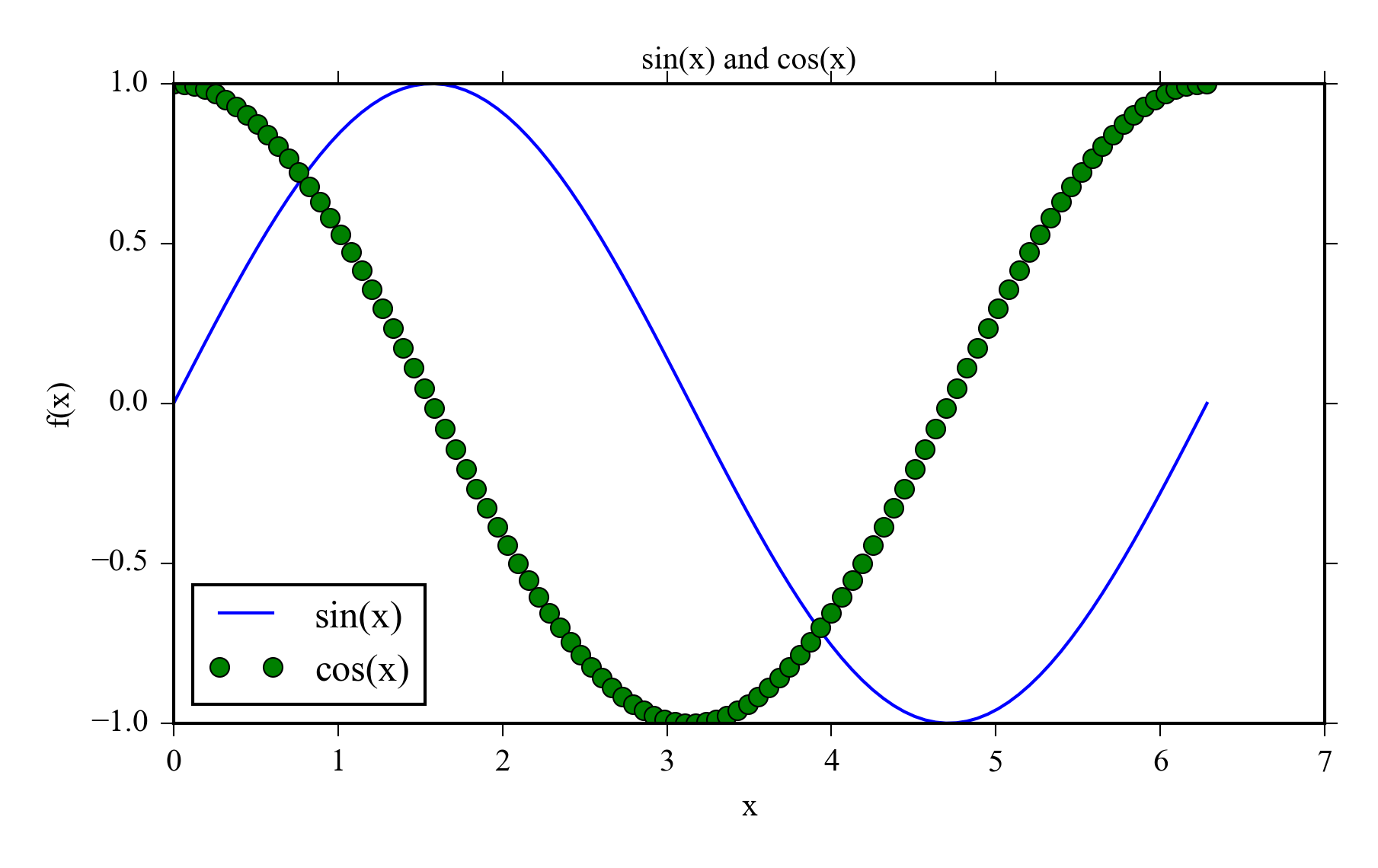
6.1 Line plots
Line plots are usually used for time series and it is often useful to plot several measurements in the same graph. Remember to make sure that the lines can differentiated also in black and white prints and remember to add axis labels and the legend.
x = linspace(0, 2*pi, 100)
y = sin(x)
y2 = cos(x)
plot(x, y)
plot(x, y2, 'og')
title('sin(x) and cos(x)')
xlabel('x')
ylabel('f(x)')
legend(['sin(x)', 'cos(x)'], loc = 3)
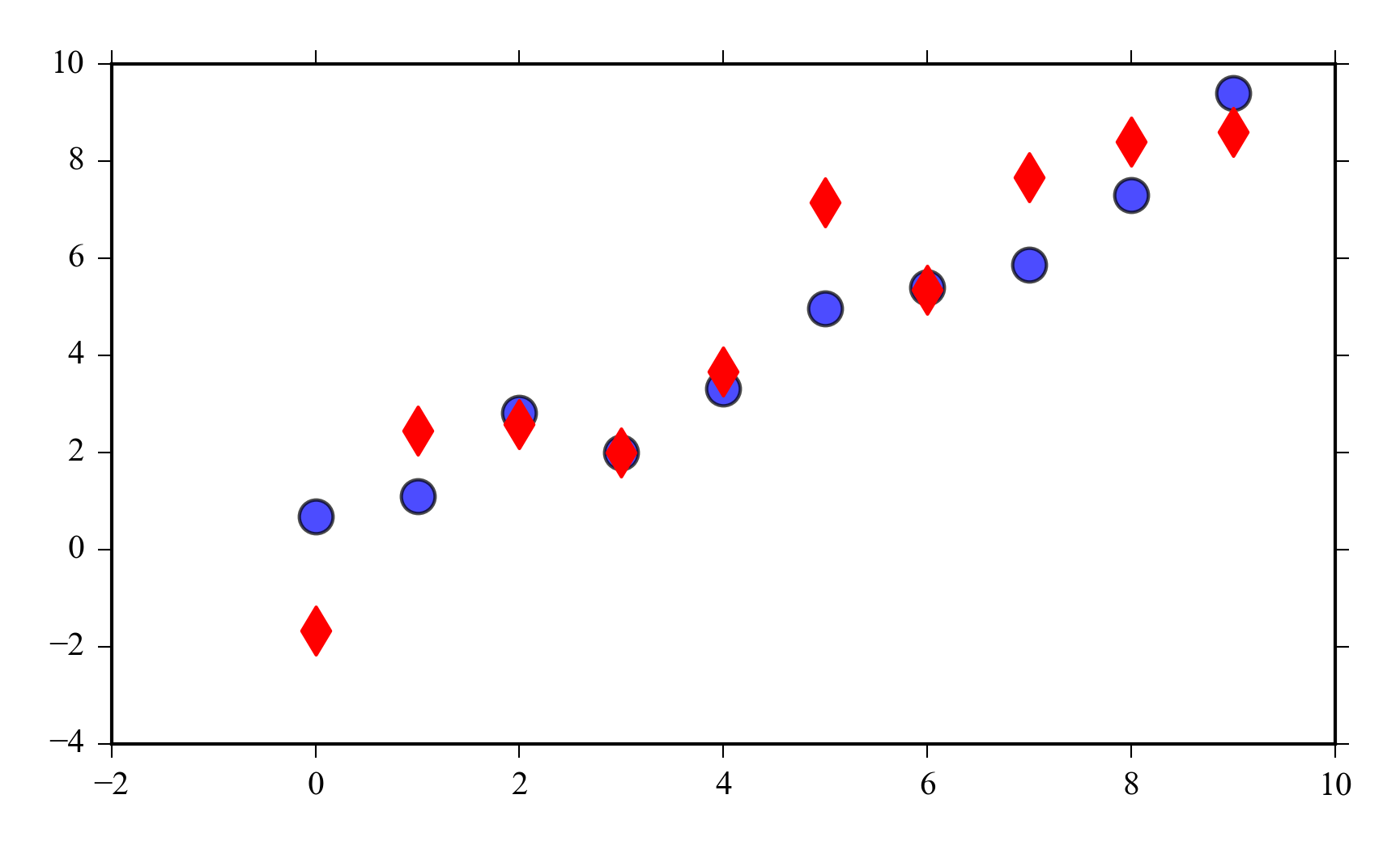
6.2 Scatter plot
Scatter plots are used to illustrate the relationship i.e. correlation of two variables. Different colors can be used to indicate groups like different treatments in an experiment.
x = arange(10)
y = x + randn(len(x))
y2 = x + randn(len(x))
scatter(x, y, s=100, alpha=0.7)
scatter(x, y2, s=100, marker="d", color="red")
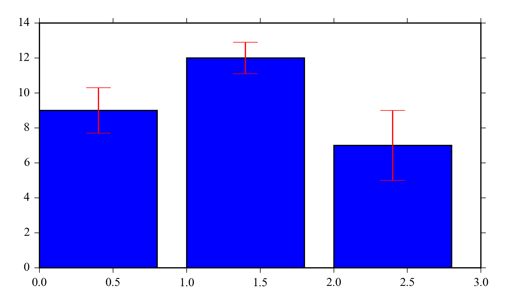
6.3 Bar plot
Bar plots are used to represent means or medians. Remember to add errorbars when you use them.
y = [9, 12, 7]
errors = [1.3, 0.9, 2]
x = arange(len(y))
bar(x, y, yerr=errors, ecolor="red",
    capsize=10)
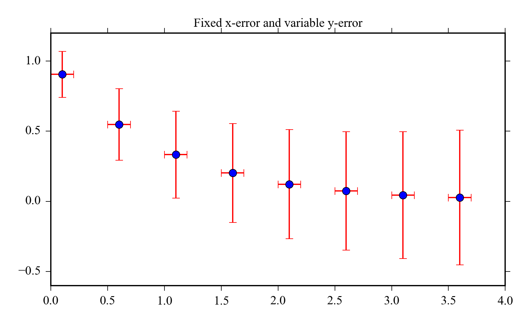
6.4 Errorbars
You can also add error estimates to lineplots or scatter plots e.g. to illustrate the uncertainty of a model or measurement.
x = arange(0.1, 4, 0.5)
y = exp(-x)
y_error = 0.1 + 0.2*np.sqrt(x)
x_error = 0.1
errorbar(x, y, xerr = x_error,
         yerr = y_error, fmt='o', ecolor="red")
title('Fixed x-error and variable y-error')
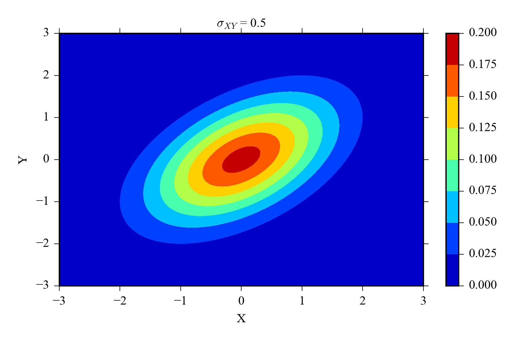
6.8 Contour
Contours are used to represent three dimensional data. The x and y coordinates are often coordinates and the z coordinates are data points at corresponding points.
Contours are often more readable than surface plots.
x = linspace(-3, 3, 200)
y = x
X,Y = meshgrid(x, y)
Z = bivariate_normal(X, Y, sigmaxy=0.5)
contourf(X, Y, Z)
colorbar()
xlabel('X')
ylabel('Y')
title(r"$\sigma_{XY}$ = 0.5")
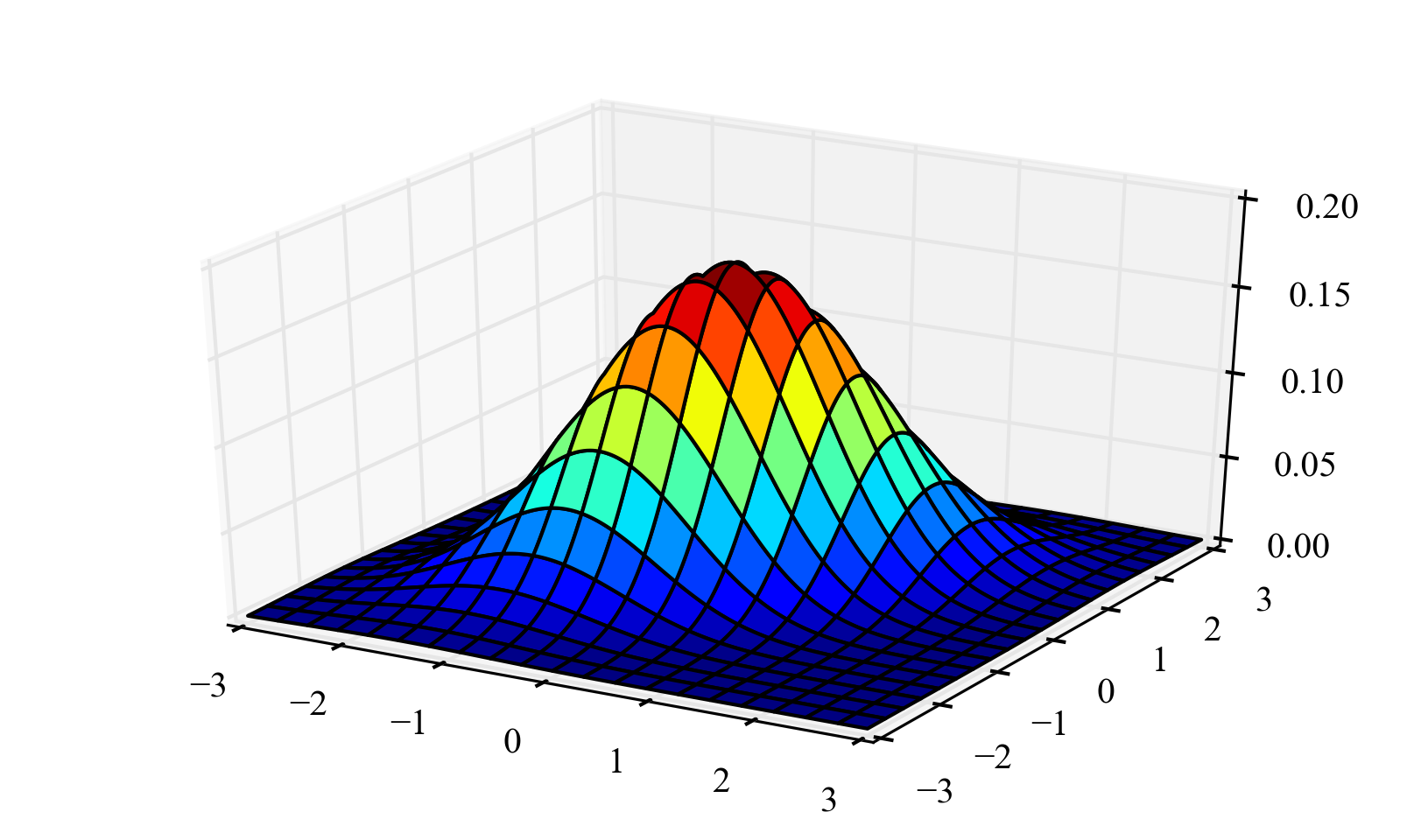
6.9 Surface plot
from mpl_toolkits.mplot3d import Axes3D
fig = figure()
ax = fig.add_subplot(111, projection='3d')
ax.plot_surface(X, Y, Z, cmap="jet")
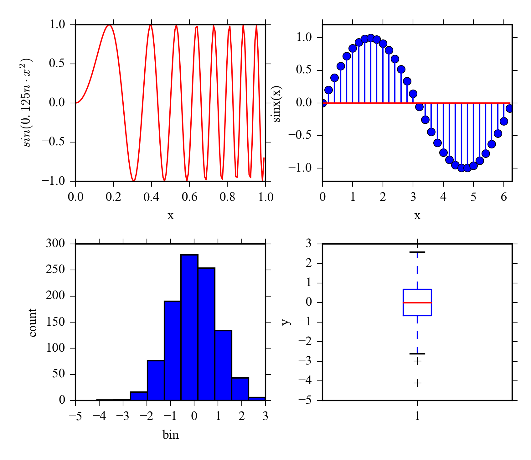
6.10 Subplots
Subplots provides a way to include several plots in one figure. This make it easy to create figures of same size for a publication or a presentation.
n = 128.
x = arange(n)/n
y = sin(0.125*pi*n*x**2)
subplot(221)
plot(x,y,'r')
xlabel('x')
ylabel(r'$sin(0.125n \cdot x^2)$')
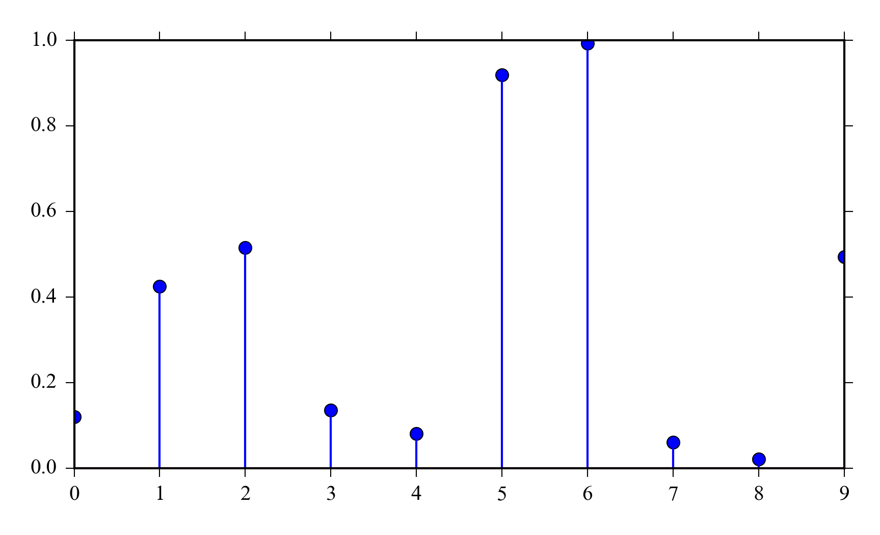
subplot(222)
x = arange(0, 2*pi, 0.2)
y = sin(x)
stem(x,y)
axis([0, 2*pi, -1.2, 1.2])
xlabel('x')
ylabel('sinx(x)')
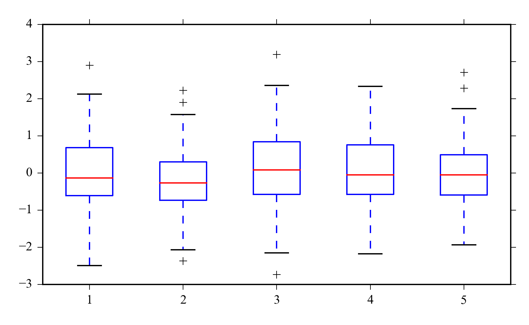
subplot(223)
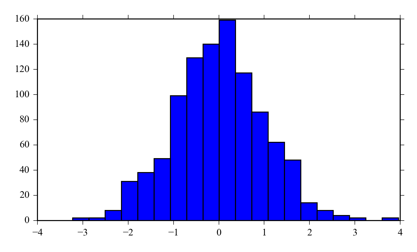
y = randn(1000)
hist(y)
xlabel('bin')
ylabel('count')
subplot(224)
boxplot(y)
ylabel('y')
6.11 Learning more
The matplotlib gallery http://matplotlib.org/gallery.html contains numerous examples and gives a good starting point for making your own plots.
Scipy lecture notes has a tutorial on customizing matplotlib output http://scipy-lectures.github.io/intro/matplotlib/matplotlib.html .